- exhibition catalog
- 2019
- offset lithography and exposed binding
- 2 vols, each 225 x 300 mm, 128 pp and 136 pp
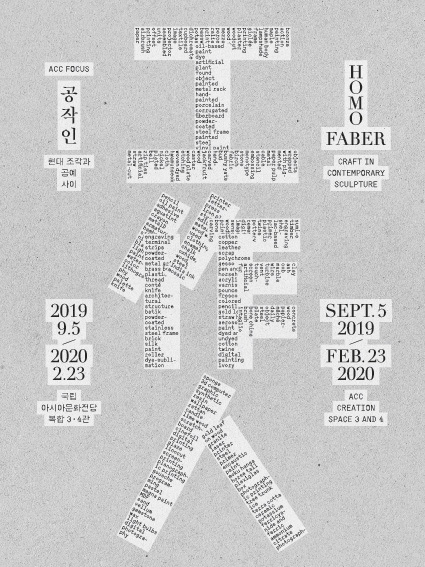
Homo Faber: Craft in Contemporary Sculpture
The title in Chinese characters is constructed by a list of the mediums actually used in the works on display, from bronze to potassium ferricyanide and ferric ammonium citrate. The show’s materiality is literally spelled out. The symmetric treatment of the elements reminds of a primitive way of construction by stacking up, as with pebble towers. The text set in a fixed-width, mechanical-looking typeface is contrasted with the neoclassical headings.
The catalog is published in two volumes, one with essays about the artists’ body of work and the other focusing on the exhibited works. The section-sewn, exposed binding suggests a craft quality.
- Photographer:
- Kim Kyoungtae
- Printer:
- Top Process, Seoul
- Commissioners:
- Asia Culture Center, Gwangju
- Kim Sungwon