

- 2014
Gwangju Biennale 2014
Identity system
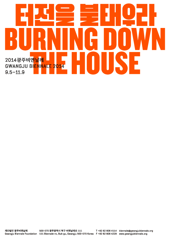
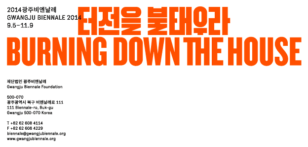
The identity for the 10th Gwangju Biennale attempts to capture the provocative theme, “Burning Down the House,” in the most direct way. Inspired by the dynamic and expansive nature of fire, a typographic system with three weights and five different line-breaks was devised to allow the title to occupy as much surface area as possible in any given space. The Korean characters were freshly drawn – in collaboration with Shin Shin – breaking some conventional rules to form a cohesive whole with the Latin counterparts.
- Project type:
- identity
- Commissioner:
- Gwangju Biennale
- Korean lettering and applications co-design:
- Shin Shin

