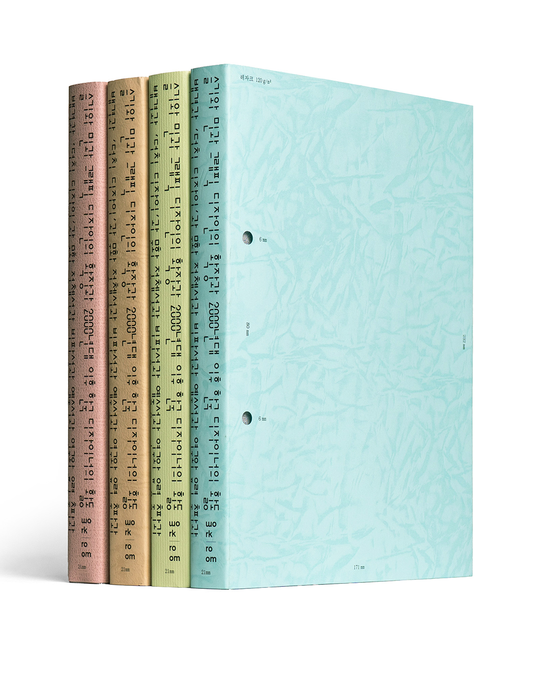
- 2025
- offset lithograph, exposed-bound and jacketed
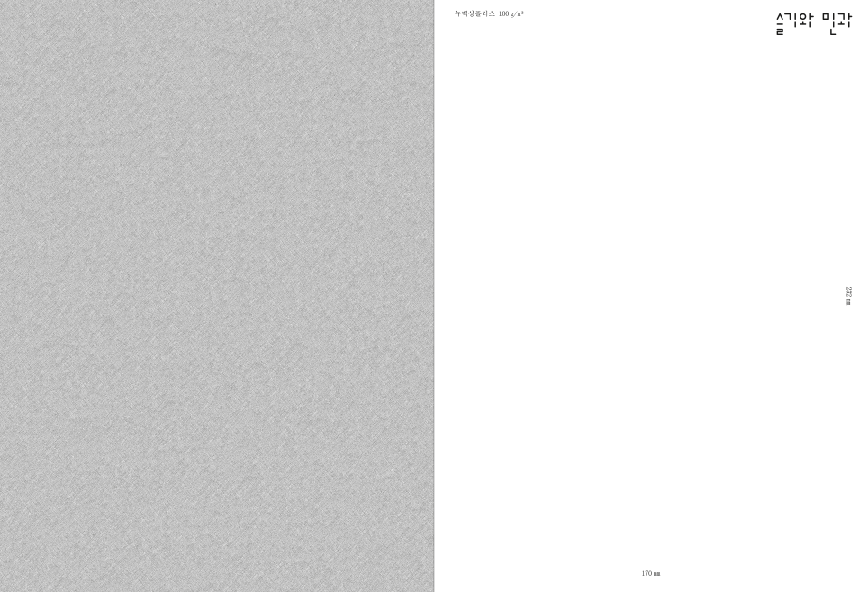
- 170 x 232 mm, 336 pp
Sulki and Min and the Expansion of Graphic Design and the Practice of Korean Designers since 2000s and “Dutch Design” and Cultural Identity and Criticality and Artistic Dimensions and Research and Spectral Publishing and Evolving Designs and Micro Typography and the Art of Language and Unordered Control and “Never Read This” and Art as Design as Art and the Phenomenon of Things Appearing Blurry When Too Close and Barely Moving Images and Questions and
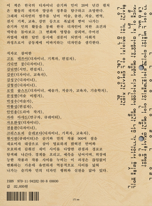
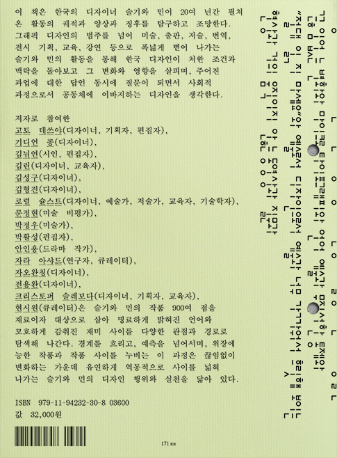
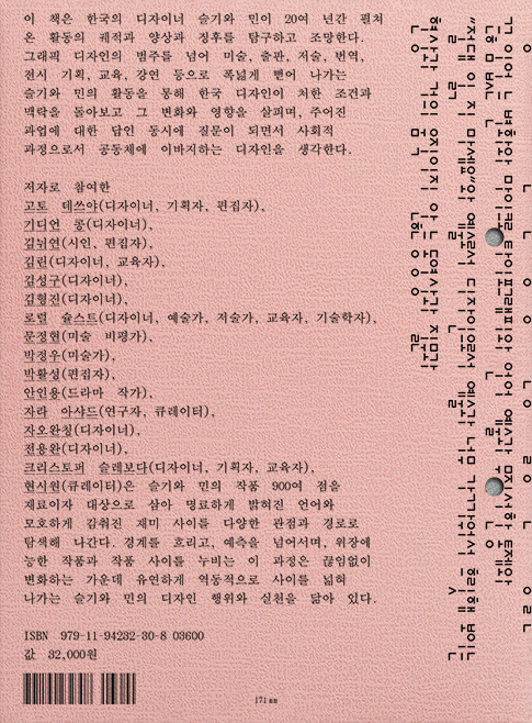
Sulki and Min and… offers an overview of the work of Korean graphic designers Sulki and Min over the past two decades, tracing their trajectories and manifestations. Through the lens of their work, which extends beyond graphic design into art, publishing, writing, translation, curation, education, and public presentations, the book reflects on the conditions and contexts of graphic design in South Korea and examines its changes and influences. In doing so, it imagines design that contributes to the community as both an art and a social process, as itself a question as well as an answer to a given assignment.
The contributors – designers, curators, editors, writers, artists, educators, a poet, a K-drama playwright, and a technologist – treat Sulki and Min’s 900-strong body of work as materials and objects, delving into the designers’ clear language and obscure playfulness from multiple viewpoints and through diverse paths. Each contributor’s navigation of the boundary-blurring, expectation-defying, and disguise-mastering works mirrors Sulki and Min’s constantly changing practice, which flexibly and dynamically expands the “in-betweens”. (From the publisher’s website)
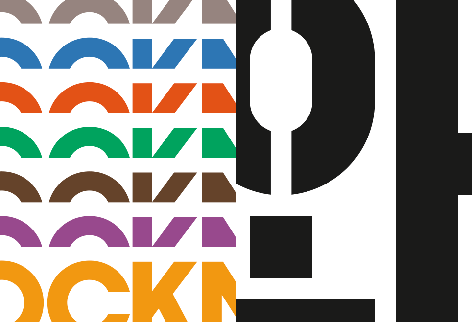
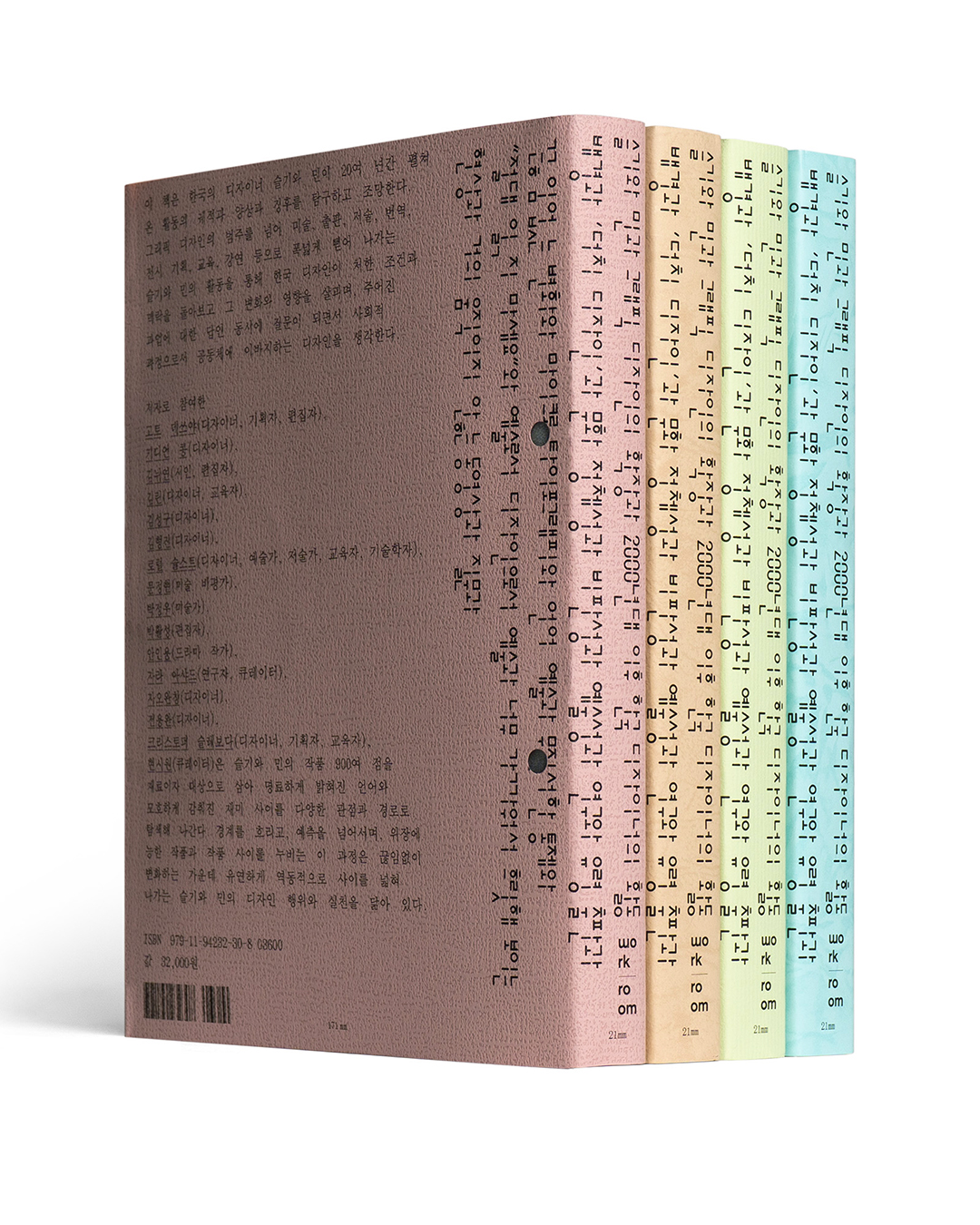
The long title directly reflects the book’s content, enumerating each article’s topics. The title’s diagrammatic and self-referential quality – related to one of our favorite approaches – reverberates in the book’s design, too. The front cover shows, instead of the title or authors, its own dimensions and materials. This gesture of exposing its own materiality extends into the inside pages.
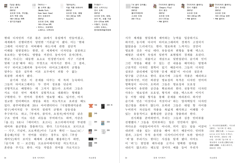
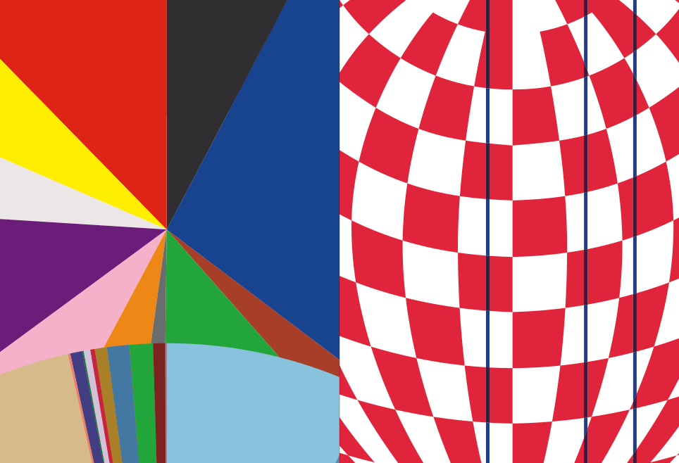
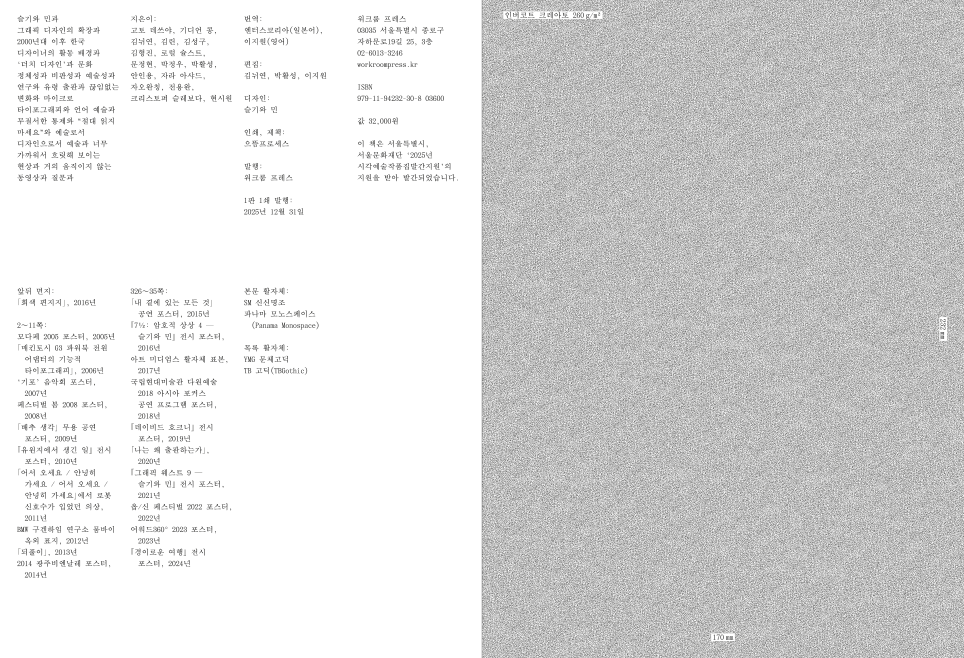
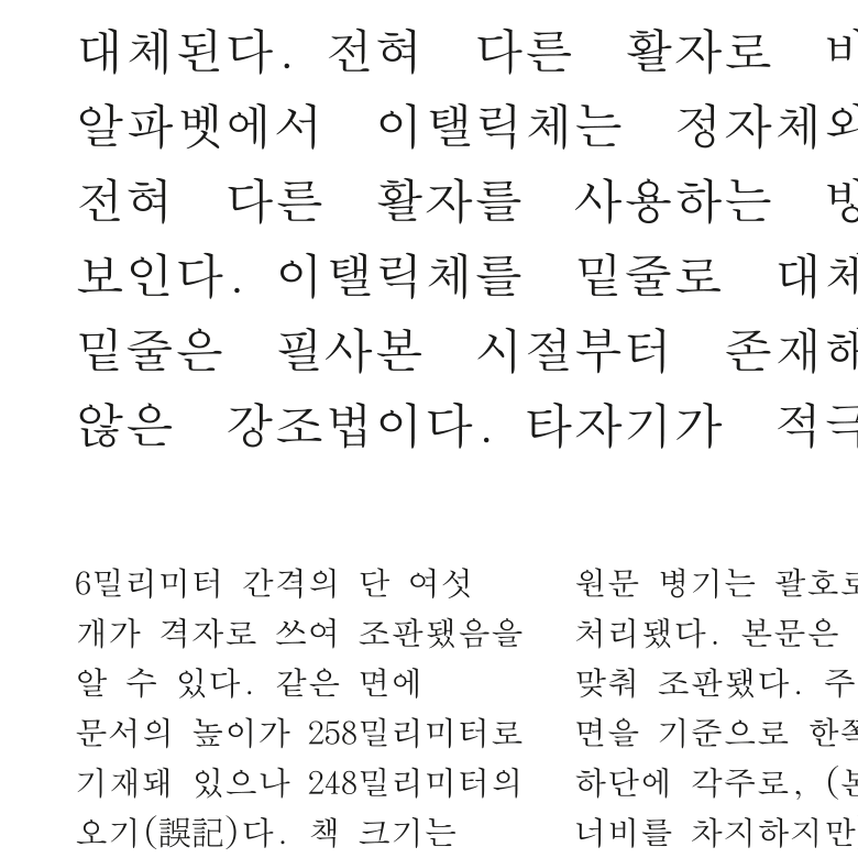
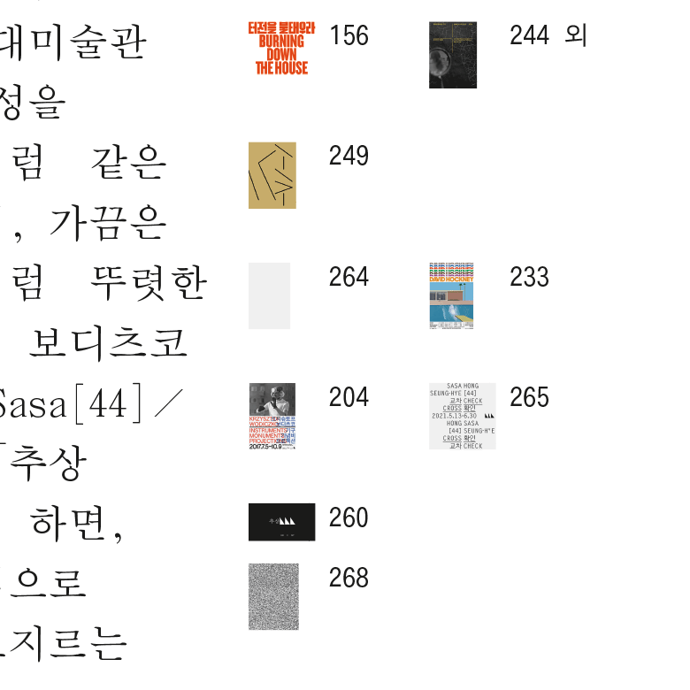
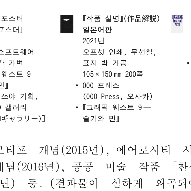
Unlike typical monographs, this book does not include reproductions of works. Instead, barely legible thumbnails serve as pointers linking the text to the list of works. The intention has been, on the one hand, to avoid wasting ink on printing images that can be easily found on the internet, and, on the other, to focus attention on the words rather than pictures. The opening and closing sections do show reproductions, but only the actual-size details that are hard to find or experience online. This use of images acknowledges and exploits the fact that the book is interconnected with a diversified media network that includes the internet and social media.
The book’s typography reflects one of our current interests: clashing – not harmonizing – Western design norms with East Asian/Korean traditions in an unexpected way. The titles are set in Protoform, a typeface we made while exploring the origins of unsquared Hangeul. The purely geometric shapes, inspired by Cho Young Jae’s 1976 proposal to restructure Korean characters for typewriters, revisit the ideas of unsquared Hangeul while creating unfamiliar letterforms by applying the same modular system to Latin letters.
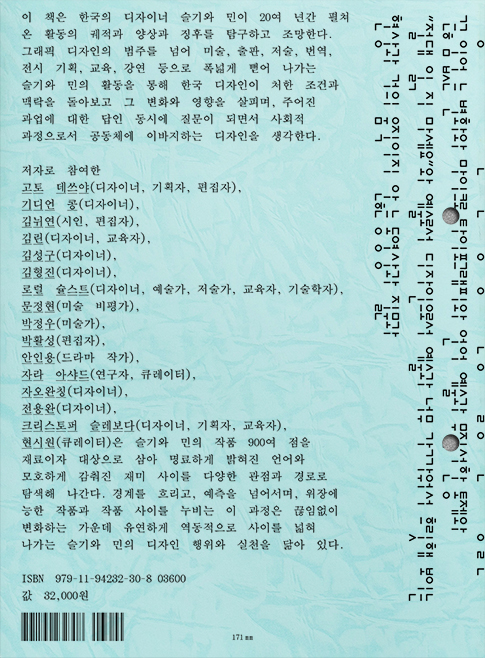
The text is composed using our interpretation of the traditional East Asian square-cell grid system. In Western typography, composition starts with letters as units and proceeds by combining them into words, lines, paragraphs, and pages. With the square-cell grid system, however, the page is first divided into equal-sized square cells, in which characters are placed. Although the system has become obsolete in Korea, many Korean typefaces still retain the monospaced, square character frames as a trace of this composition tradition. What if we revive the petrified tradition and apply it to a modern Korean text setting? In this book, the Hangeul characters and word spaces are set in square cells, while punctuation marks, numerals, and Latin letters are set in half-width spaces. Also, unlike conventional square-cell grid composition, the lines are unjustified, resulting in unfamiliar-looking text patterns that are distant from both traditional East Asian and Western typography. The elegant and widely used text typeface, SM Sinsinmyeongjo, looks crude and alien in this setting.
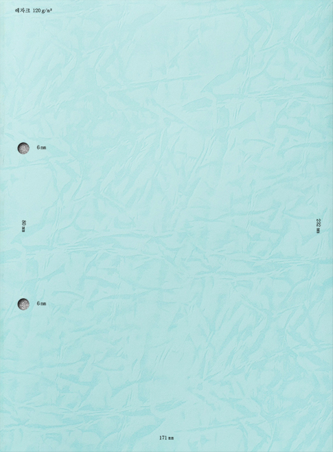
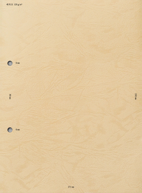
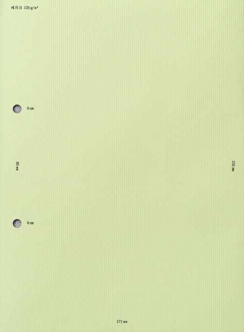
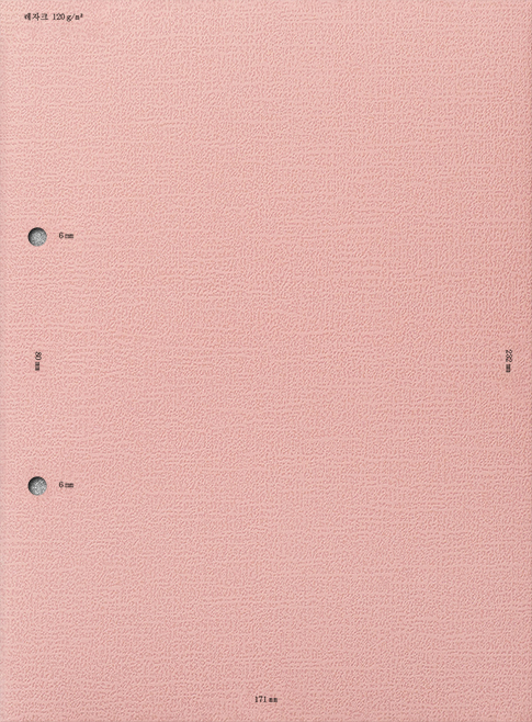
The paper inside is the commonplace uncoated stock that we often use. The banal, leather-like paper of the dust jacket, combined with the unusual design employing the geometric title typography and the empty front, reinforces the theme of the strangely familiar or vice versa.
- Project type:
- publication
- Written by:
- An Inyong
- Bak Wu
- Christopher Sleboda
- Gideon Kong
- Goto Tetsuya
- Hyun Seewon
- Jeon Yong Wan
- Kim Hyungjin
- Kim Lynn
- Kim Nuiyeon
- Kim Sung Koo
- Laurel Schwulst
- Moon Junghyun
- Park Hwal-sung
- Zara Arshad
- Zhao Wanqing
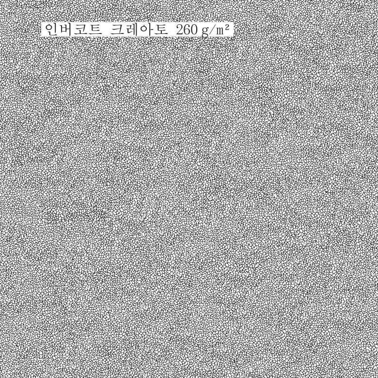
- Printed on:
- Invercote
- Leathack
- smooth uncoated paper
- Printed by:
- Top Process
- Commissioned by:
- Workroom Press
- See also:
- Publisher’s page