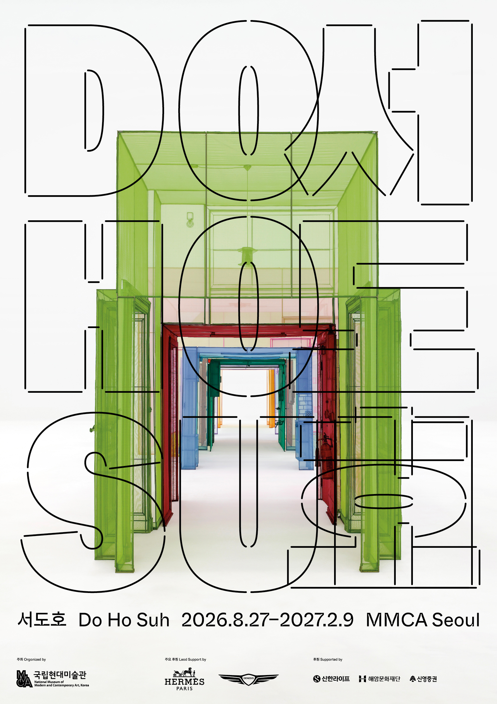
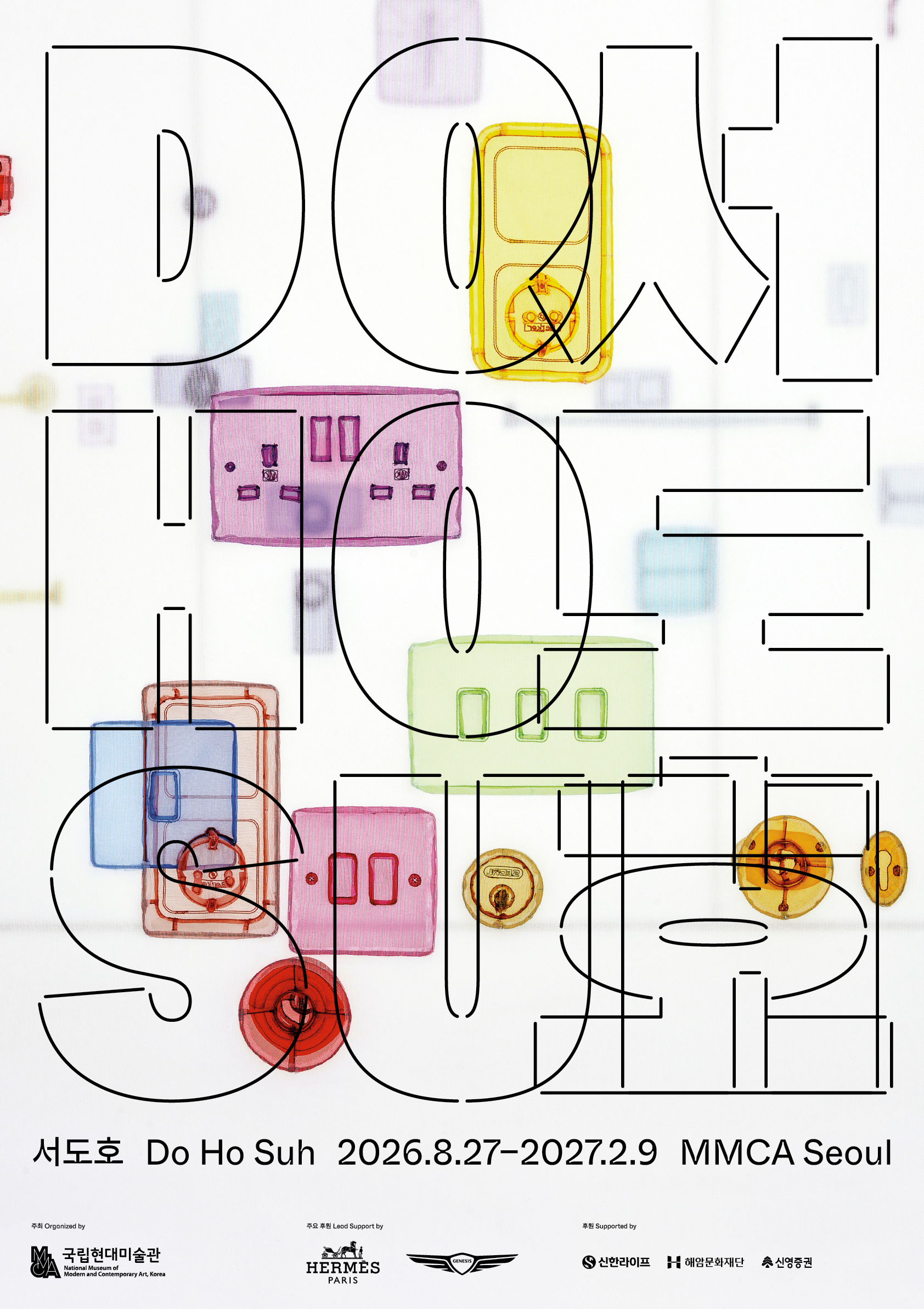

- Exhibition poster
- 2026
- offset lithograph
- 594 x 841 mm, three versions
Do Ho Suh
The poster was designed and produced in three versions for the artist’s first comprehensive retrospective at the MMCA. The title typography, using large, bold characters rendered as outlines with open corners, looks heavy yet feels light – much like the artist’s fabric architecture. The carefully chosen, cropped images are visible through the titles.
- Project type:
- poster
- Typeset in:
- Whyte Hangul Inktrap
- custom letterform
- Printed on:
- smooth uncoated paper
- Printed by:
- Top Process
- Commissioned by:
- National Museum of Modern and Contemporary Art (MMCA)