- exhibition brochures
- 2019
- offset lithograph, saddle stitched
- 108 x 150 mm, 16 pp, fourteen versions (English and Korean, each in seven different covers)
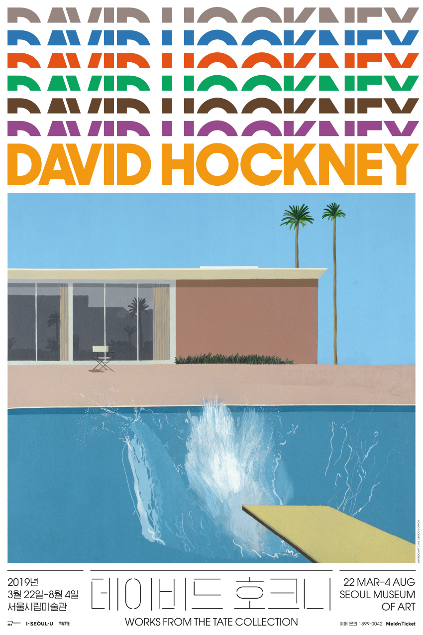
David Hockney
The seven-tier heading reflects the structure of the retrospective, which consists of seven sections for different phases in Hockney’s evolving body of work. The display type is a version of Avant Garde Gothic, designed by Herb Lubalin in the same year as Mr. and Mrs. Clark and Percy, one of the most famous paintings by Hockney and a highlight in the exhibition. Overall, the typography aims to be elegant, and interesting in a slightly affected manner.
It was one of the most popular exhibitions ever held at the SeMA, and the free brochure was in great demand. It came out in multiple prints, each time with a different cover.
The SeMA David Hockney exhibition won a Korean Design Award in the identity design category in 2019.
- Project type:
- print collateral
- Printed on:
- smooth uncoated paper
- Printed by:
- Top Process
- Commissioned by:
- Lee Seungah
- Seoul Museum of Art