- no. 1
- 2017
- offset lithograph, adhesive bound
- 120 x 186 mm, 256 pp
Epi
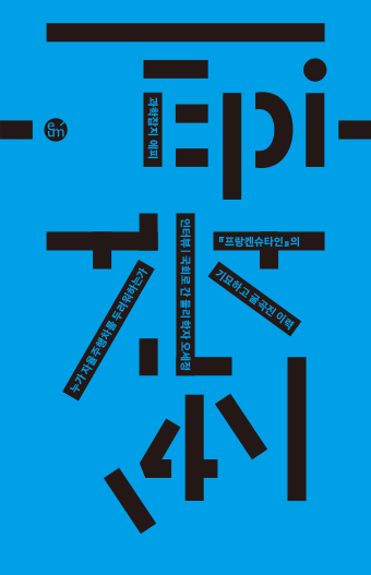
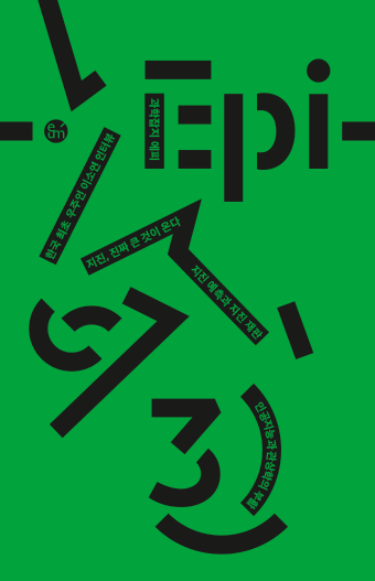
The bookish typography on the small format is meant to add both informality and seriousness to the critical magazine. A hyphen extends from the logo on the front cover through the fore edge, back cover, spine, to the front cover again, forming a continuous cycle around the book. Bars of the same thickness (3 mm) used in the logo, section titles, opening pages, and other visual elements are a recurrent visual theme.
- Project type:
- publication
- Commissioned by:
- Eum


