- 2026
- offset lithograph, case bound and jacketed
- 207 x 261 mm, 368 pp
Landscape Architecture of Amorepacific
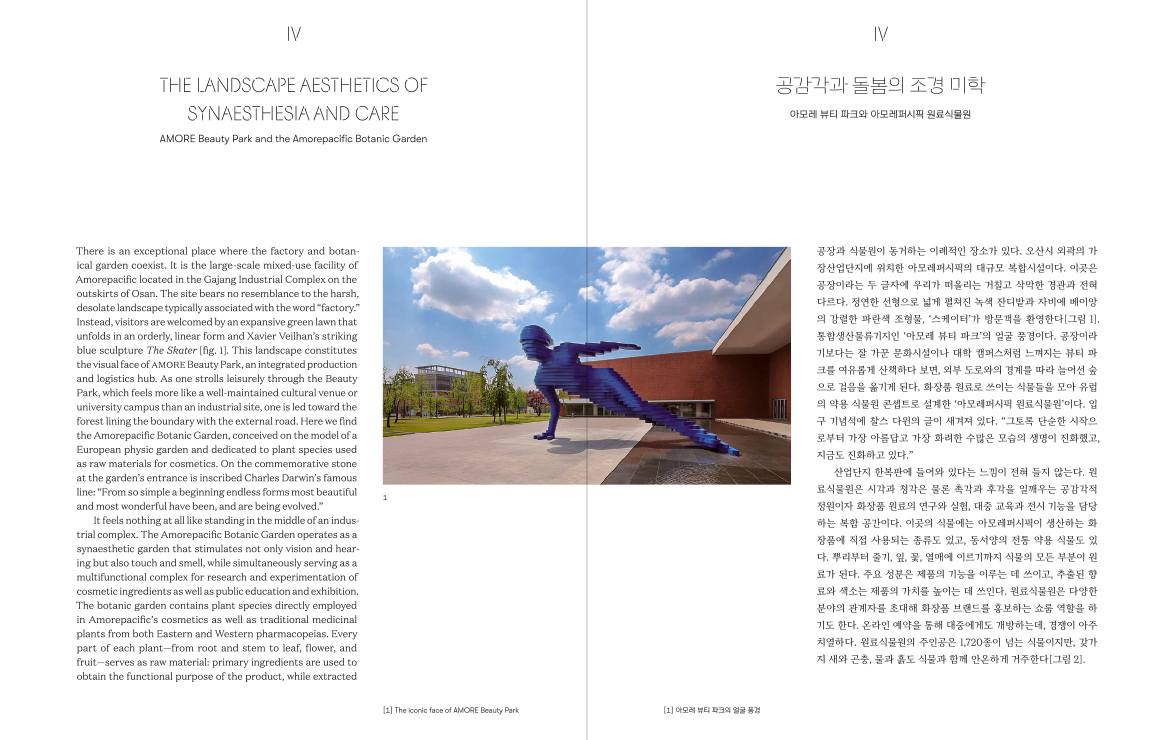
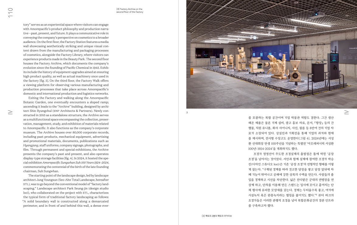
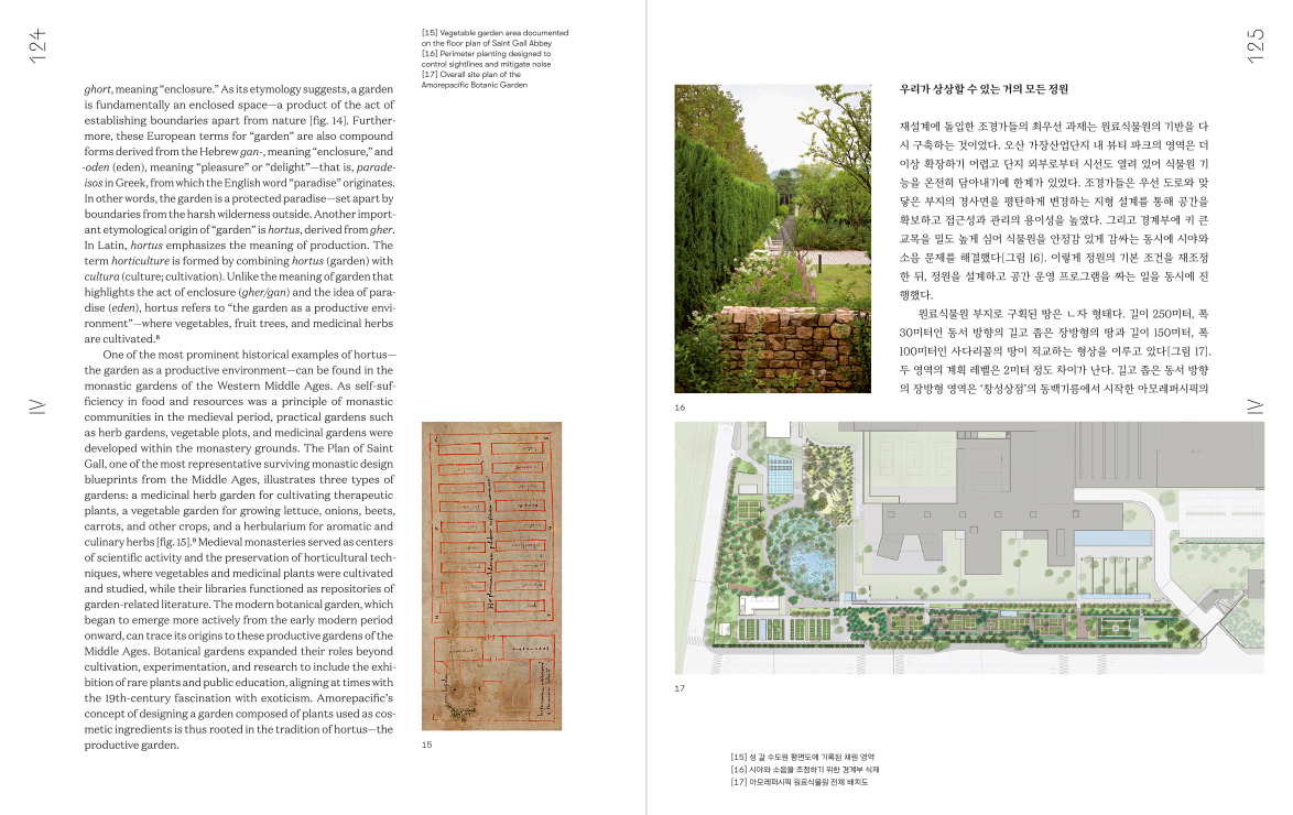
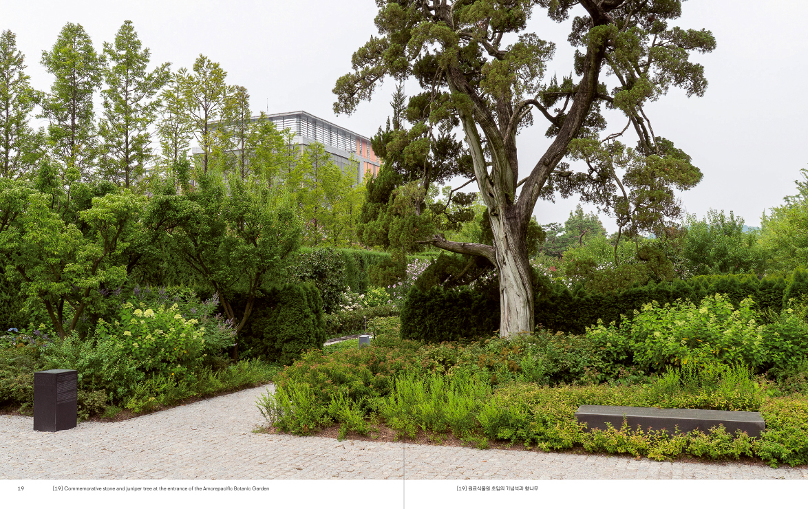
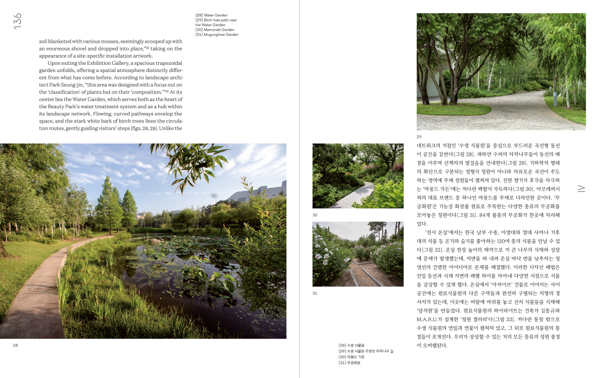
As the second volume of what has become a series about the company’s cultural achievements, Landscape Architecture of Amorepacific explores in depth the cosmetic conglomerate’s major landscape projects. The design continues the forms we established for Architecture of Amorepacific in 2018. The first book’s format, binding, and tone, as well as the graphic treatment on the dust jacket, were all designed for a standalone publication commemorating the opening of the company’s new headquarters, without considering a series identity. Now that such a consideration is necessary, the challenge was to adapt some of the design elements already in place – reflecting the headquarters’ architecture designed by David Chipperfield – into a more flexible system.
We decided that the dust jacket would inherit the graphic lines, originally devised to mimic the optical effect of the headquarters’ surface, and adapt them to the new subject: organic horizontal lines for landscape, rather than straight vertical ones for architecture. These same graphic lines would then be modified and arranged each time differently for a different subject.
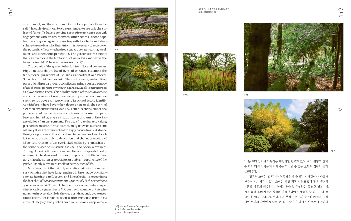
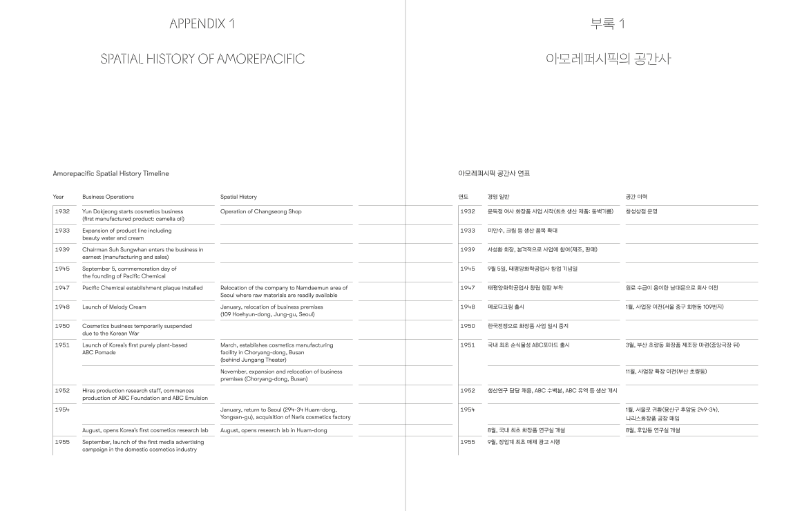
While we concluded that the page design should remain flexible for future books, the typographic structure of this book closely follows that of the previous work, given the strong relationship between the two fields. However, we changed the typeface from Arita, Amorepacific’s corporate font, to its serif version, and set the text to justified alignment instead of flush left. Consistent with the jacket’s adaptation from vertical to horizontal, we also rotated the headers and folios by ninety degrees to display them vertically.
- Project type:
- publication
- Written by:
- Pae Jeong-Hann
- Printed on:
- Munken Polar
- T-EOS
- Printed by:
- Top Process
- Commissioned by:
- Amorepacific Corporation
