installation views by Hong Cheolki, courtesy of Seoul Museum of Art
- exhibition wall graphics
- 2019
- adhesive plastic film
- Various sizes
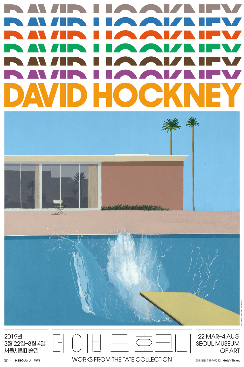
David Hockney
The seven-storied title typography reflects the structure of the major retrospective of David Hockney, which consists of seven sections that show different phases in his evolving body of work. The display typeface is a version of Avant Garde Gothic by Herb Lubalin, which was designed in the same year as Mr. and Mrs. Clark and Percy, one of most famous paintings by Hockney and a highlight in the exhibition. The Korean headings are set in a similarly geometric yet contrastingly thin typeface. Overall, the typography aims to be elegant and interesting in a slightly affected manner.
The SeMA David Hockney exhibition won a Korean Design Award in the identity design category in 2019.
- Project type:
- environmental
- Typeset in:
- ITC Avant Garde Gothic
- Commissioned by:
- Lee Seungah
- Seoul Museum of Art