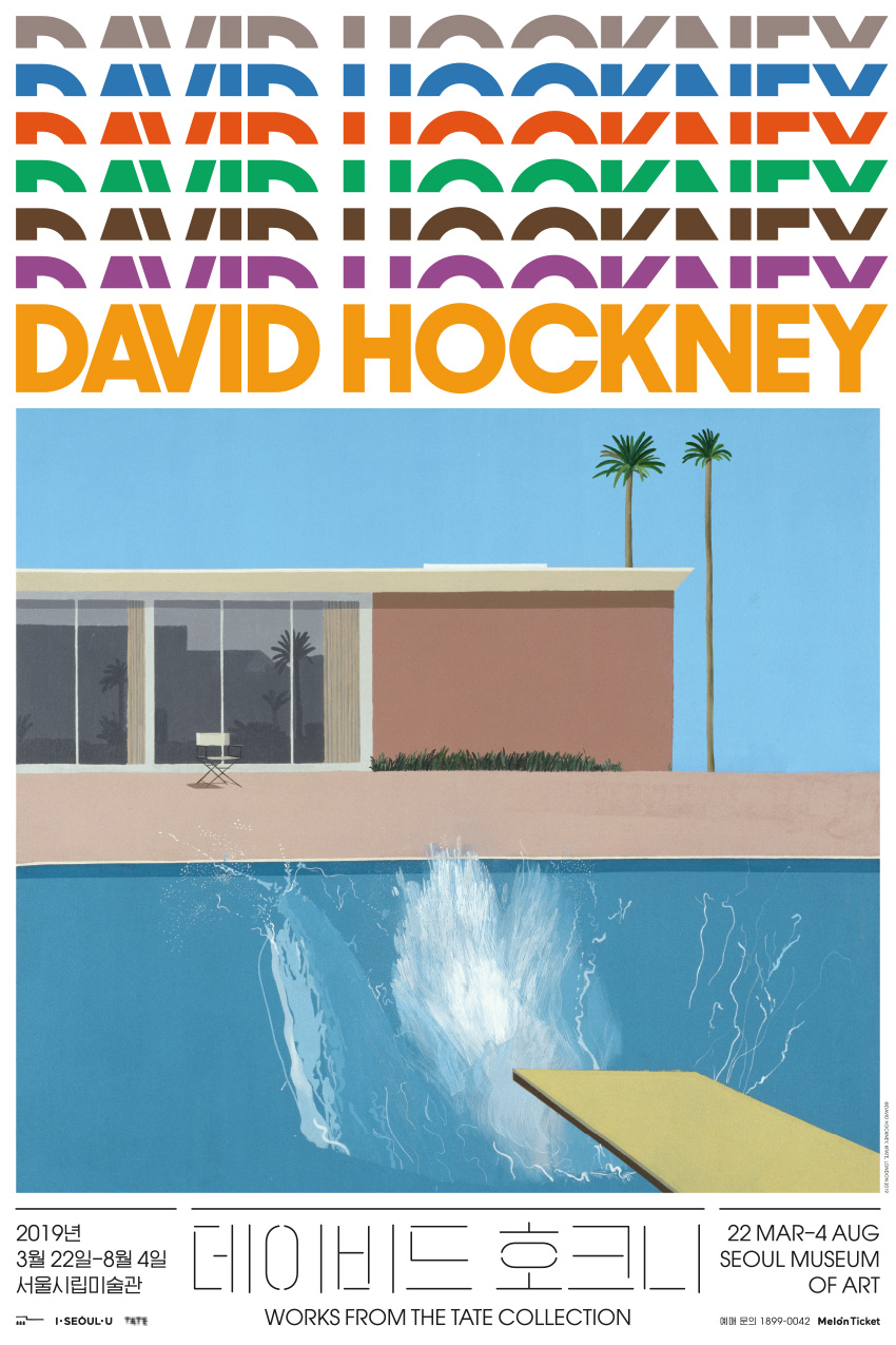
The seven-tier heading reflects the structure of the retrospective, which consists of seven sections for different phases in Hockney’s evolving body of work. The display type is a version of Avant Garde Gothic, designed by Herb Lubalin in the same year as Mr. and Mrs. Clark and Percy, one of the most famous paintings by Hockney and a highlight in the exhibition. The Korean type is similarly geometric yet of contrasting weight. Overall, the typography aims to be elegant, and interesting in a slightly affected manner.
The SeMA David Hockney exhibition won a Korean Design Award in the identity design category in 2019.
- Project type:
- digital collateral
- Commissioned by:
- Lee Seungah
- Seoul Museum of Art